

Logo and visual identity for the social care sector
Client
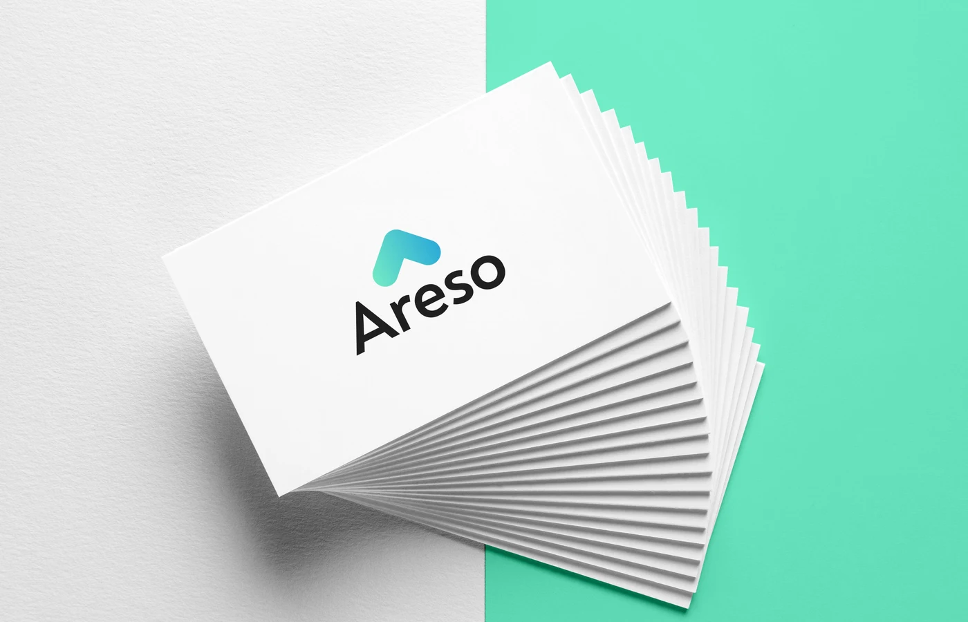
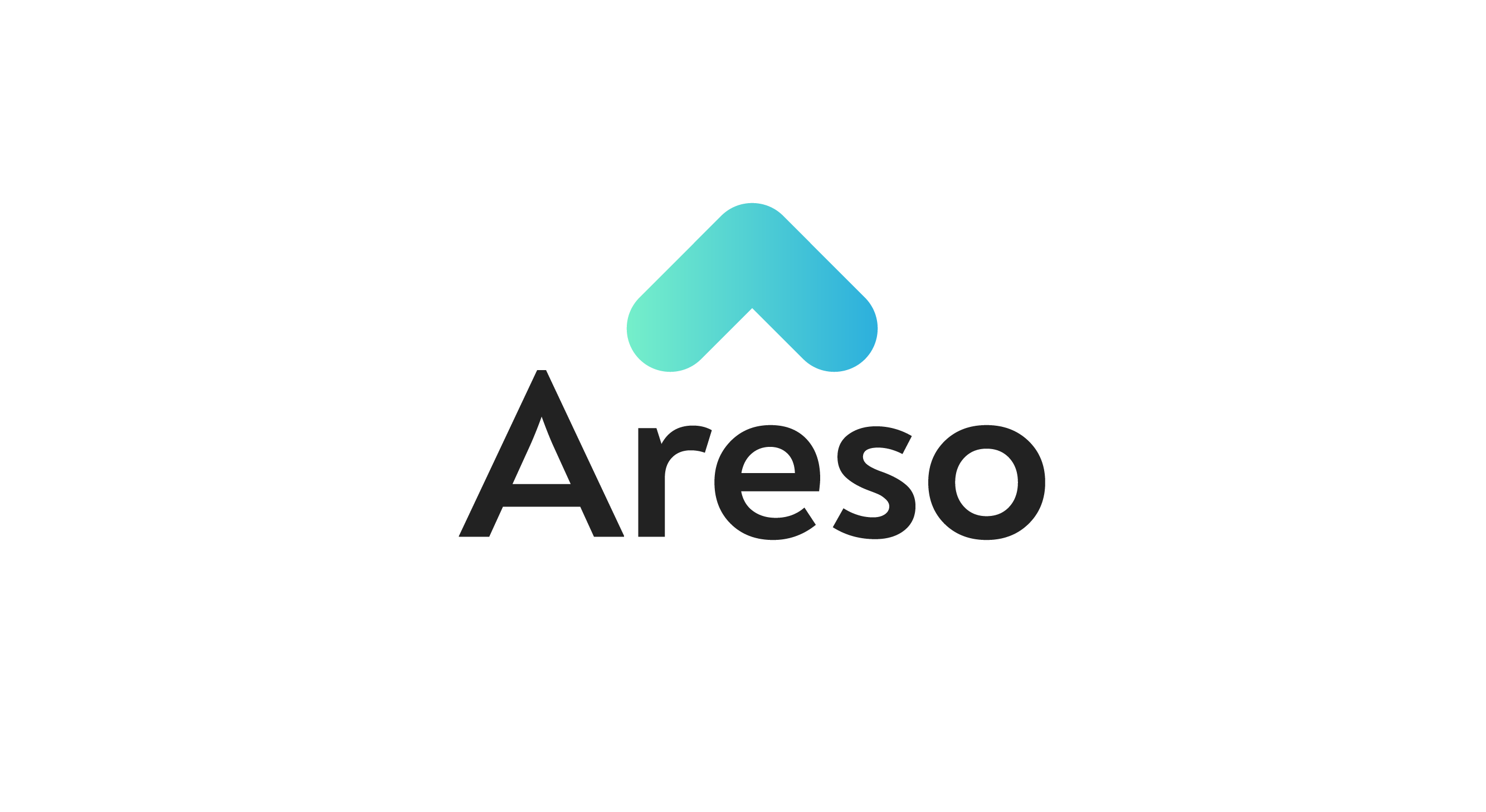
Areso
Year
2020
Services
Brand identity
Logo design
Agency
Studio
Matilda Ripenberg

A brand identity focusing on people and care
Challange
Areso works in the healthcare and social care sector, helping authorities find suitable families for placements. They needed a brand identity that felt warm, inclusive and trustworthy, flexible enough to work across multiple service areas, always with people and care at the centre.
Solution
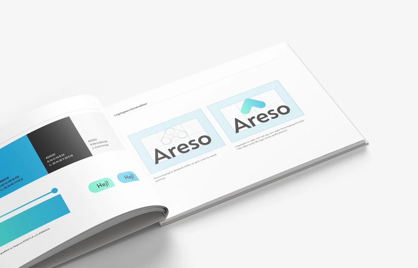
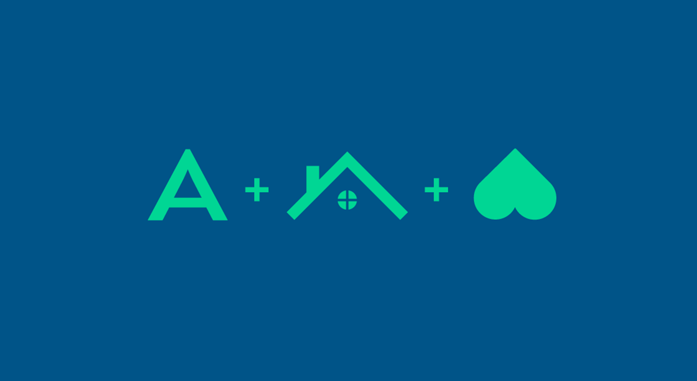
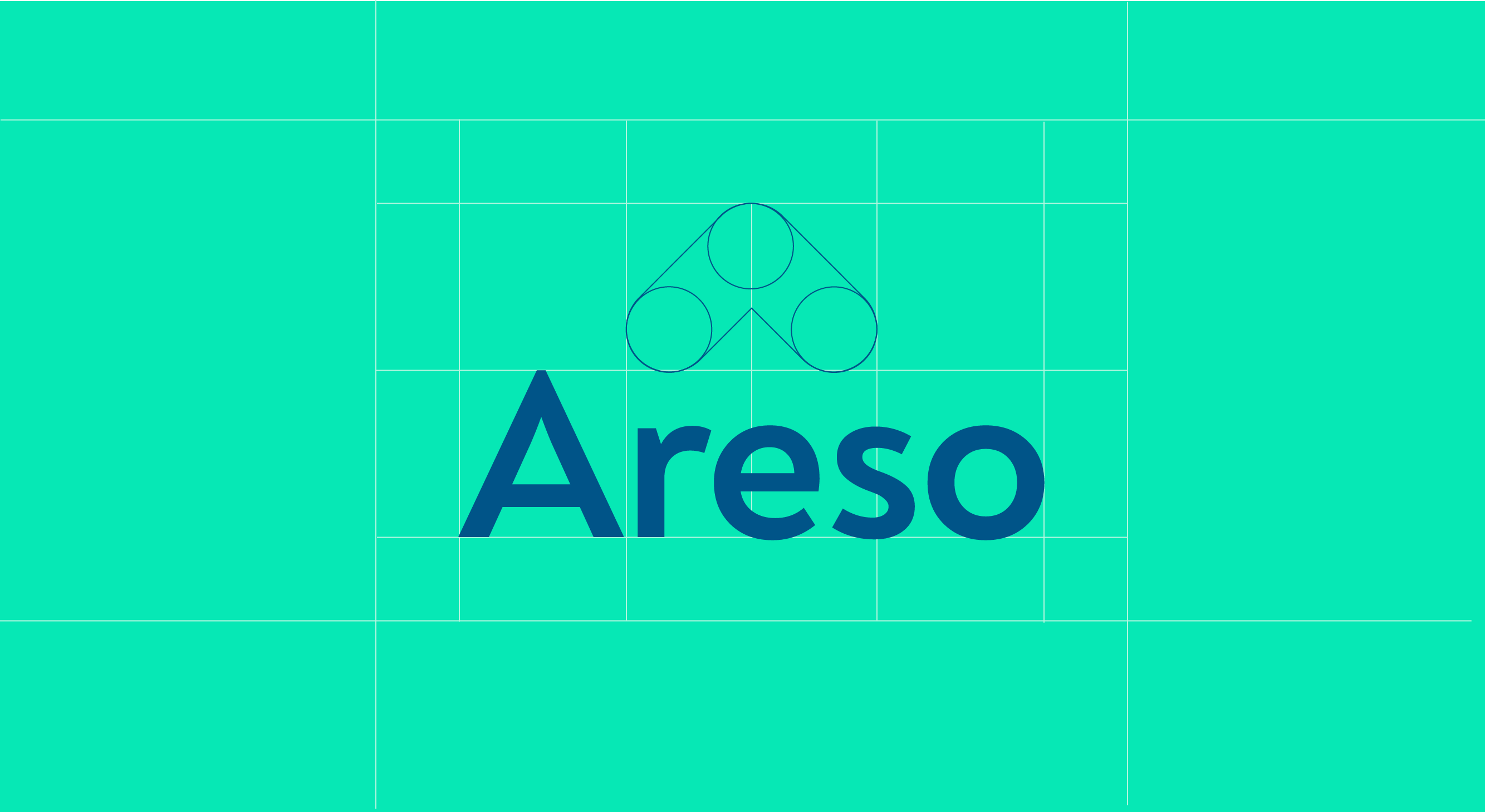
I developed a complete visual identity built around the concept of ”home” as a safe place for those in need. The logo mark is derived from the letter A in Areso, shaped into a roof, connecting the brand directly to its mission. The delivery included guidelines for logo, typography and colour use, marketing materials, and web design principles built on accessibility standards.
Result
Areso received a cohesive and purposeful brand identity that communicates warmth and professionalism across all touchpoints, giving the team clear guidelines to build and grow the brand consistently. The web design guidelines focus on creating an easy-to-use visual identity online while following accessibility standards.
Logo process
Colour palette
#232323
R:35 G:35 B:235
C:71 M:65 Y:64 K:72
#75EFCA
R:117 G:239 B:202
C:50 M:0 Y:35 K:0
#2BB0DE
R:43 G:176 B:222
C: 70 M:10 Y:5 K:0